Branding · Websites · Apps · UX/UI · Content
Nolum: brand and digital product for inner work
Our team's own product. Nolum helps a person see what stands behind their reactions and change them over time. We built all of it: the name, the logo, the identity, the landing page and the web app. The mobile app is in progress.
This is our team's own product: we built all of it ourselves, from the name to the app.
- Client
- Nolum
- Industry
- Digital product, personal growth
- What we did
- Branding, Websites, Apps, UX/UI, Content
Challenge
Every reaction has a root cause. Irritation, fear, saying yes when you wanted to say no, avoiding conflict, self-sabotage. All of it forms in past experience and drives behaviour quietly, without the person noticing. They can see they react in a way they do not want, but they cannot change it, because they cannot see what is behind it.
Nolum exists to find that root cause and work through it. Not to talk about it, but to change the reaction to the same situations in real life.
The product grew out of the personal experience of the studio's founder. Looking for the root causes of his own reactions, working through them, changing them. At some point it became obvious that no tool takes a person through that path step by step.
Hence the brief. Find a name and a visual language for a subject where it is very easy to slip either into esoterics or into clinical coldness. Build a product people come back to regularly instead of opening once out of curiosity. Prepare a separate landing page that explains the business to investors and partners. And design an interface where difficult inner work feels calm and clear.
Solution
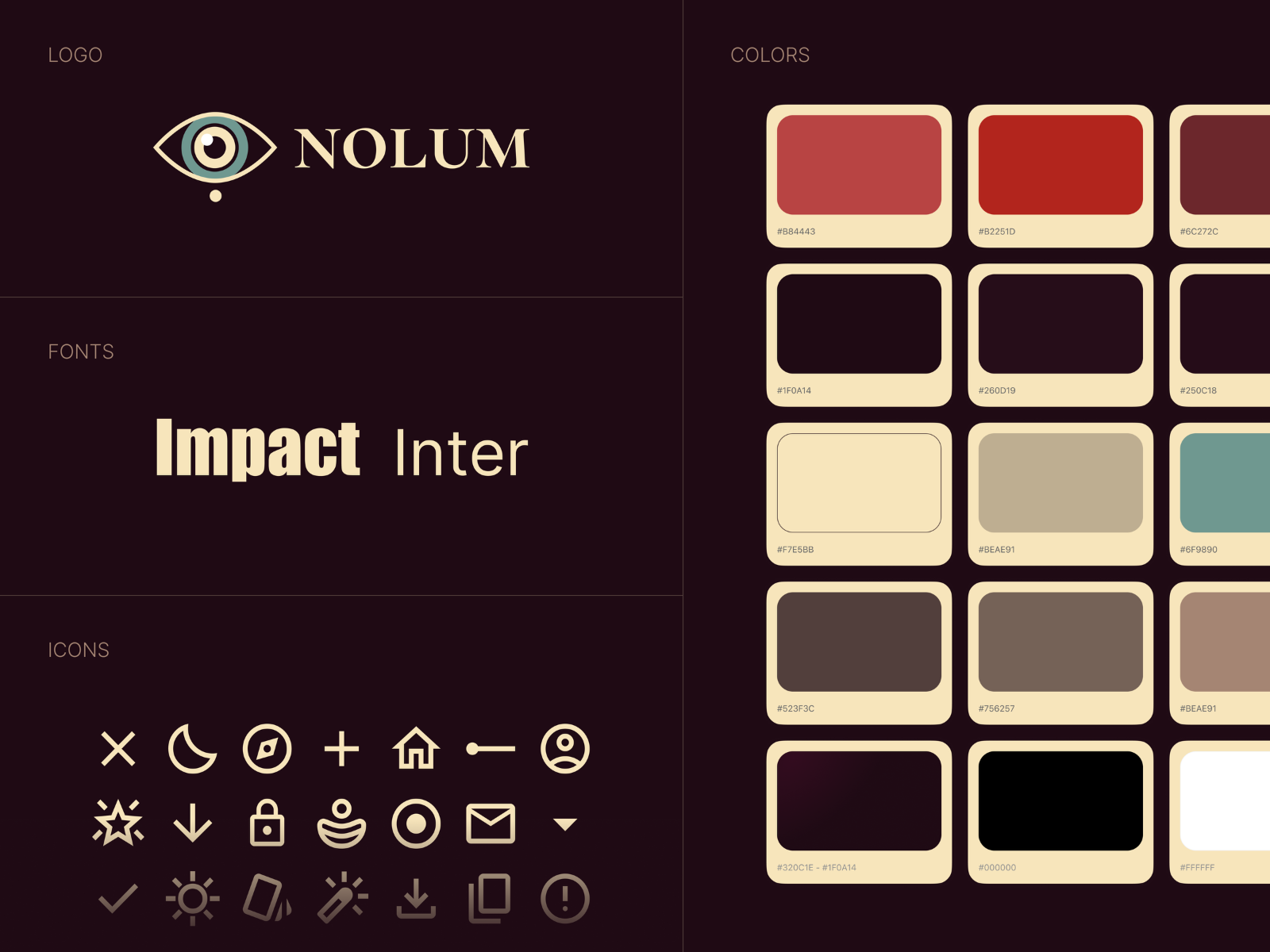
The name. Nolum comes from no lumen, "without light". We look for the shadows and bring light to them, so the name speaks about the work itself instead of promising that it will be easy.
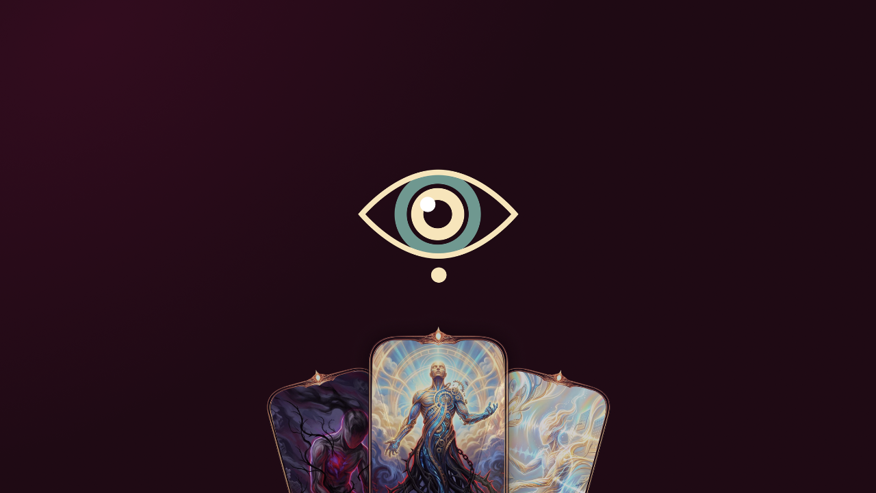
The logo. An eye at its core: Nolum looks into you. The mark is simple and works equally well as an avatar, an app icon and a slide in a deck.
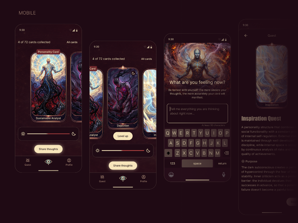
The identity. A dark atmospheric palette and a game-like logic. The subject is delicate, but working on yourself should not feel like a therapy office. The visual language is built so that a person enters a flow and comes back again, and wants to open and collect the cards.
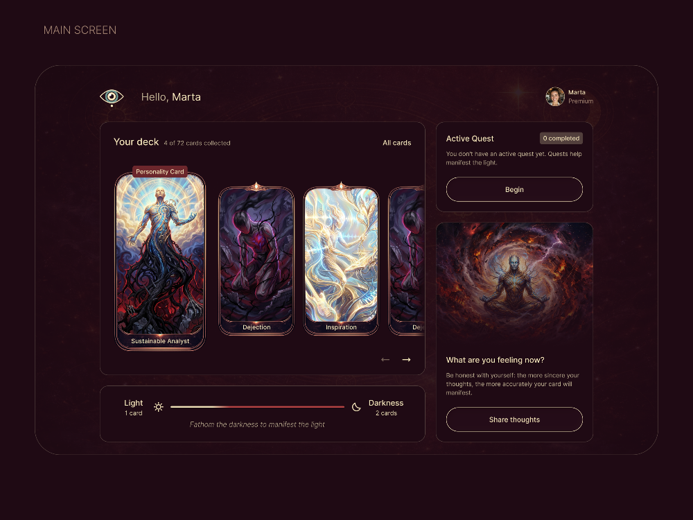
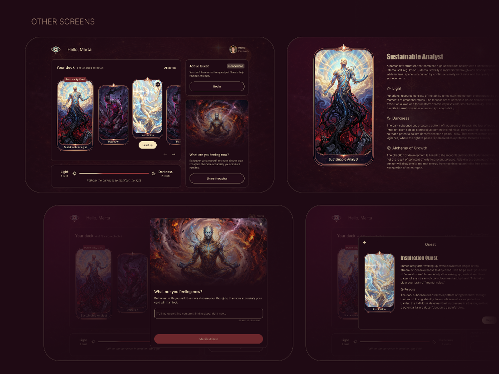
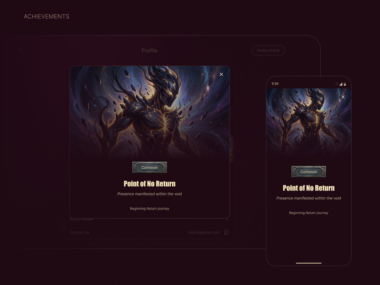
The product. A person describes a situation, an emotion or a reaction they want to understand. In return they get a card, a visual reflection of what stands behind it, and a quest: a concrete action in real life aimed at that exact root cause. Cards form a deck, and the deck gradually becomes a full picture of the personality.
The landing page. A separate product for investors, banks and partners. Its job is to explain the business rather than sell a subscription, so it is built differently from a regular product page.
The web app. The main product, responsive, running at app.nolum.io.
The mobile app. Currently in development.
Result
It took about five months to go from the idea to a working product. Design took roughly a month.
Today the landing page and the web app are live, and the mobile version is in development.
For us this is the fullest example of how we work. The name, the mark, the identity, the landing page, the interface and the product itself were made by one team and hold one logic, so nothing feels assembled by different people. Client projects run the same way: from the name to a working product in one pair of hands.
Want the same?
Tell us about your business — we'll suggest a solution and give you the exact price before any work starts.
Start a project